A Quick Introduction to Typography Grids in Graphic Design

Yesterday on BoardGameHour, the discussion focused on writing and formatting rulebooks. I'm no writer, as you might be able to tell from my rambling blog posts, but I can speak a little bit about the basics of how to organize images and text on a printed page. For that, we come to one of my favorite tools in graphic design, the grid.
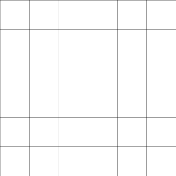
You might be familiar with the idea of a grid being something like this, but in graphic design the grid is more like a waffle. Like syrup, your text and images fits into the cells while keeping the borders clear. The idea is that you do not see the borders of the grid, only the cells. Text and images span these cells vertically and horizontally, but the grid keeps things looking nice and organized instead of a jumbled mess.
Here's a quick overview of what grids do, some examples, and a downloadable template I made just for you!
What do grids do?
Wrangles lots of different elements onto a page. Grids let you organize body text, headers, diagrams, art, tables, and charts so they're all well-proportioned in relation to the page.
Keep your text columns from being too wide. If a line of text goes beyond about 2.5 alphabets in length, the eye starts to wander. A good grid keeps your columns nice and tight.
Make spacing consistent. When you space out images, columns, and other elements from each other, a grid gives you a consistent amount of clearance around each element.
Examples of Grids
Here are some examples from Josef Muller Brockmann's Grid Systems in Graphic Design.


You can use those grids to organize a LOT of content, which you see most often in magazines that pack in full-color photos into as many pages as possible. The example below is from Monocle magazine Issue 81.

In rulebooks, you can use grids to to organize really complicated and text and images that needs to flow logically from one block of information to another. Check out this double-page spread from a tutorial in the Krosmaster rulebook.

You also see grids in RPG books, where there is usually more text than images, but designers still have to integrate charts and tables into the mix. Check out this double-page spread from the fifth edition of Dungeons & Dragons.

Download the IDML file
And that's your quick introduction to typographic grids! Here's a simple three-page IDML file I've put together for your reference. Happy designing!


Comments
Post a Comment